Optimizing account management
Cricket Wireless • My Account
Mobile Optimization & Consistency
View Desktop Prototype ︎
Role: Senior UX Designer


Opportunity
• Drive Self-Service
• Reduce calls to Customer Support
• Increase Customer Retention
• Optimize Design
• Drive Self-Service
• Reduce calls to Customer Support
• Increase Customer Retention
• Optimize Design
Contraints
• Recent site merger & redesign
• Inconsistent design across site
• Mobile optimization needed
• Cricket’s first Agile implementation
• Recent site merger & redesign
• Inconsistent design across site
• Mobile optimization needed
• Cricket’s first Agile implementation
Process
Ready for Mobile Optimization
As part of the recent merger with AIO Wireless, Cricket recently completed an extensive brand redesign. Next on the product roadmap was the mobile optimization of the authenticated user experience to enable customers to service their accounts from any device.
Extensive work and user testing had already been completed on mobile optimized wireframes, all that was needed was to dig in and design!
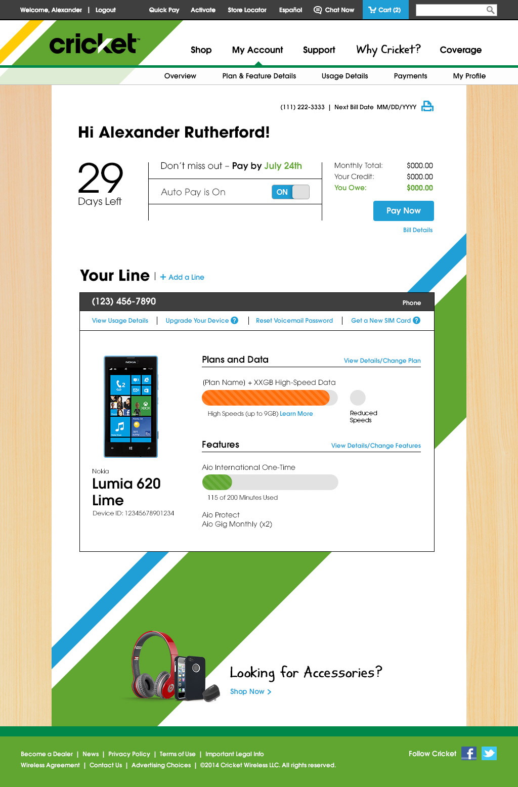
Cricket Wireless 1.0
![]()

Design Process
Cricket’s new mobile optimized product needed to take advantage of patterns established in the recent redesign efforts and reduce inconsistencies across all digital touch points.
Design choices needed to emphasize the user’s ability to make payments, sign up for auto pay to reduce churn, and clarify data usage - three primary business objectives.
Aligning with wireframe guidance, design kicked off implementing new visual patterns on mobile, first!
New Visual Patterns
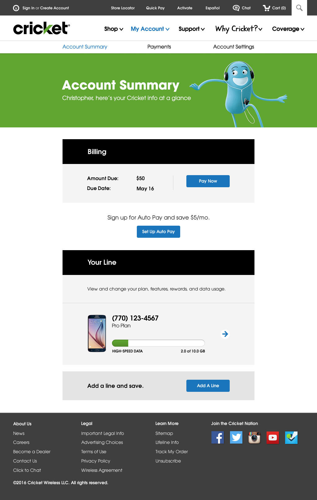
![]() My Account for Mobile with Applied Patterns
My Account for Mobile with Applied Patterns
![]()
![]()
 My Account for Mobile with Applied Patterns

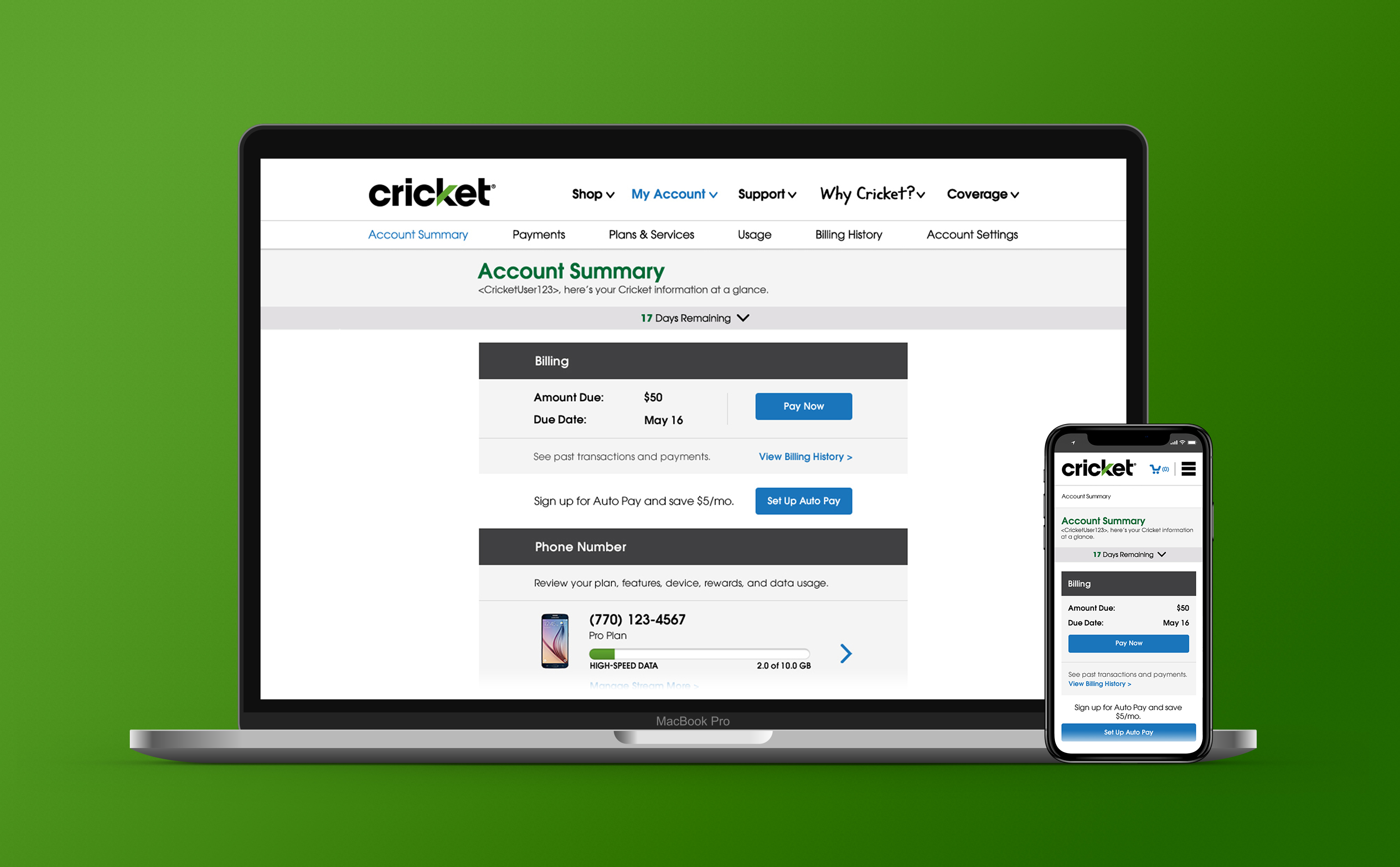
Desktop versions were developed once designs were streamlined for mobile. Layouts were adjusted to accommodate for responsive breakpoints.
My Account for Desktop


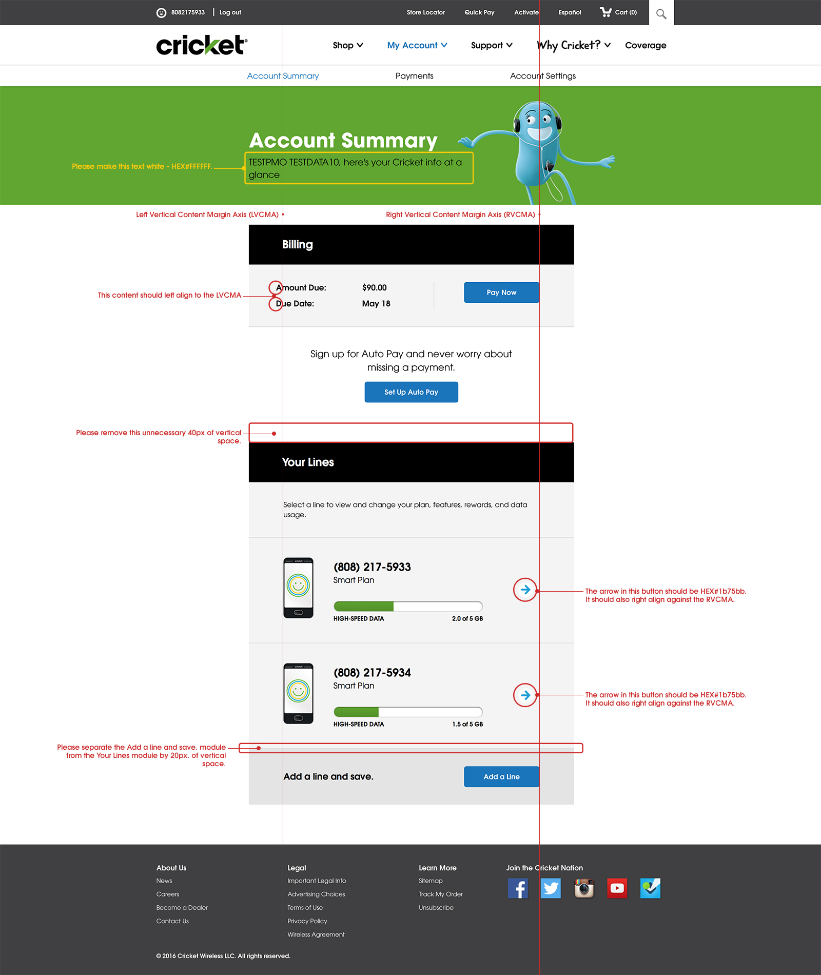
Utilizing the Agile Methodology, designs were handed off in batches to be developed in sprints. Design validation was executed through numerous UAT sessions and prioritized against product functionality and development resourcing.
Deliverables during this time ranged from updated comps to redline documentation as needed.
Deliverables during this time ranged from updated comps to redline documentation as needed.
Development UI Guidance

Mobile Optimization launched successfully in the summer of 2016.
Performance Research
After the successful launch, user testing and feedback began to track performance and identify areas for improvement. JITRs, surveys, and customer calls were utilized to identify ongoing opportunities.
After the successful launch, user testing and feedback began to track performance and identify areas for improvement. JITRs, surveys, and customer calls were utilized to identify ongoing opportunities.
Ongoing Optimization
The team has been actively coordinating with the business to evolve the mobile optimized experience and then test with Cricket’s Usability teams.
Design has been focused on optimizing layout and scan-ability, reducing inconsistencies in patterns across platforms and driving towards the implementation of the Cricket Pattern Library to improve efficiency.
Notable design optimizations include:
• Page header size optimization
• Base vertical padding optimization
• Reduced Global Pattern Inconsistency
• Legal Text Optimization
• Improved Brand Asset Integration
Recent My Account Design Optimization
![]()

Results
• Optimization launched in Q2, 2016
• Design refresh launched Q3, 2017
• Customer calls reduced 44%
• Digital Churn at 48% less than stores
• Optimization launched in Q2, 2016
• Design refresh launched Q3, 2017
• Customer calls reduced 44%
• Digital Churn at 48% less than stores
What’s Next
• Personalization & Modular Design
• Increased Consistency
• A/B Testing
• Pattern library integration
• Personalization & Modular Design
• Increased Consistency
• A/B Testing
• Pattern library integration
Current Employment
Nordea • København, DK
Product Owner / Lead Designer
Jan 2019 - Present
Nordea • København, DK
Product Owner / Lead Designer
Jan 2019 - Present
Awards
2017 Cricket Wireless
Best Visual Appeal and Aesthetic
2017 Cricket Wireless
Best Visual Appeal and Aesthetic
© 2018 andrewpaynecreative.com